Tuesday, May 1, 2012

Single Daffodil Orange Strip SOLD

Another daffodil, this time in a vertical format.  I like how the silhouette of the daffodil breaks up the background into interesting shapes.

Sunday, April 29, 2012

Orange Centered Jonquil on Gold SOLD

Another spring jonquil with a gold background and a dark diagonal stripe.  A mostly neutral palette with just touches of saturated color - orange. green, rusty red.  Those neutrals give the saturated colors lots of contrast and make them important.   The jonquils have been blooming for weeks, they're almost over.  Maybe just one or two more paintings.

Thursday, April 26, 2012

Sunset Ferry Crossing Blake Island SOLD

This large painting is an evening view of one of the Washington State ferries passing in front of Blake Island on its way between Southworth and Seattle.  This painting will be in the spring Barnworks Show during the Vashon Spring Arts Tour on May 5th & 6th and May 12th & 13th.  The Barnworks has been hosting Spring and Fall Arts shows since the 1970's and this is the Last Year, and the Last Spring Show!  Barnworks is located at 12122 Cove Road SW on Vashon Island. 

Monday, April 23, 2012

Jonquil with Diagonal Orange Stripe

The same white jonquil slightly different composition.  I really like the blue background.  Again the painting is mostly blue for dominance.  The orange stripe in the background adds a nice bit of conflict and repeats the orange of the jonquil cup and the warm tones in the stem.

Saturday, April 21, 2012

Jonquil on Blue and Turqouoise

The white jonquils with orange centers have opened in the garden.  I was eager for a new color after all the gold daffodils on gold backgrounds so I decided to try blue.  I find my compositions are better when I have color dominance; here, it's a very large piece of blue with just a bit of gold and green black and white.  And I like the turquoise contrasted with cobalt blue. 

Wednesday, April 18, 2012

Two daffodils Purple tabletop

The gold background is essentially a dark yellow, so this painting is a study in complementary colors - purple and yellow.  I enjoy that the lightest parts of the painting are the highlights in the glass jar. 

Monday, April 16, 2012

Pink and Yellow Apples

These are Pink Lady apples.  I love the color of these apples, they're red and yellow and green.  I simplified some of the streaky detail because it's hard to add light and dark pattern and not have it look like shadow.  The apple in the back IS in shadow so I darkened the yellow and reduced the contrast to push it back.  

Friday, April 13, 2012

Single Daffodil Gold and Green

Another daffodil, and a very limited palette.  Because the colors are analogous,  the painting is very harmonious.  The background is a gradation from medium to dark.  Dark value pushes the pale flower forward while medium value enables lost edges, and keeps the flower from feeling like it's cut out and pasted down on top of the painting

Wednesday, April 11, 2012

Two Purple Crocuses SOLD

We've had a cold late spring so I got to paint crocuses in April.  These crocuses were moving the whole time I was painting.  Even outdoors they only last a couple of days.   Most of this painting is purple and lavender.  This creates color dominance.  It also makes the gold sing (complement of purple) even though it is not a huge leap in value from the purple.

Tuesday, April 10, 2012

Daffodil with Dark Background SOLD

It's been a late spring so we've still got daffodils.  I like how crisp and sculptural they are and I like what an interesting and recognizable silhouette they have.   I think the jar worked well and I enjoy the orange stripe.

Saturday, April 7, 2012

Piner Point SOLD

Low tide at Piner Point at the south end of Vashon Island.  This painting was originally 9" x 12" and it just wasn't working. The foreground just wasn't very interesting- it was all sand and gravel.  I didn't want to paint every speck of sand, but I didn't know how to create interest while at the same time subordinating the foreground.    I solved the problem by simply cropping off the foreground. When in doubt, leave it out.

Wednesday, April 4, 2012

Barometer in Brown SOLD

Barometer Mountain sits at the end of the airport runway on Kodiak Island where we used to live.  I like this composition--mostly middle values with a small amount of dark and just a touch of light in the sky.  It's very Kodiak weather- mostly overcast with just a small cloud break.   Spring green shows in the foreground, but the top of Barometer is still brown from the long winter.

Sunday, April 1, 2012

Woody Island Lagoon


A scene from Kodiak Island where I used to live.  I like the composition of this painting.  There's a nice placement of the horizon line.  The colors are harmonious (ultramarine blue and burnt sienna make a wonderful gray).   I've divided the page up in a dramatic and interesting way, because I have a large piece of medium value a small piece of light value and a smaller piece of dark value.  Not a sunny day, but still some interesting light in the horizon. 

Thursday, March 29, 2012

Daffodil on Gold

The daffodils are blooming like crazy even though we've had rainy cool weather.  I like how sculptural these flowers are and how lovely and translucent the light struck areas.  This was painted with lots of juicy medium - I wiped out a lot of the lights so the whites are thinly painted.  I try to put each color down once, but I always wind up going back into areas, wiping out  and repainting.

Tuesday, March 27, 2012

Yellow Cup and Yellow Peppers on Yellow

I was kind of carried away with the intense yellow theme.  But yellows are fun to paint - how do you make a dark yellow? If you add black pigment, yellow turns green.  You can add the complement, purple, and that makes a warm brown.  So somewhere between the two is where I aimed.  I may try this one again only using less saturated color.

Sunday, March 25, 2012

Single Camellia

This painting  is from last year when the camellias were blooming.  (We've had a late cold spring so no spring camellias so far).  I like the stiff leaves and the waxy petals, and I enjoy the odd stiff composition created by those stiff leaves.  I also enjoyed the flower color; dark enough to suggest the deep center, but light enough to show translucency.  

Thursday, March 22, 2012

Yellow Cup, Red Peppers on Red


This painting is full of saturated color.  The sweet red peppers on top of a red tabletop threw a lot of red tone into the yellow cup.  It was a lot of fun going for strong colors.  The painting to look at when you need a cheery color to wake you up.

Friday, March 16, 2012

Vinegar and Saffron

The small bottle contains a pinch of very expensive saffron.  It contains more air than spice, but it's sealed with a nice cork and some gold twine and looks very impressive.  When I arranged this composition, I cropped the fork and spoon and vinegar bottle to create some interesting negative shapes.

Tuesday, March 13, 2012

Salt Shaker and Spoon on Brown

This salt shaker with its shiny silver top has lots of sparkle and reflection.  So when I added the shiny spoon I decided to simplify the background to keep the composition from being too busy.

Sunday, March 11, 2012

Yellow Cup, Red Peppers on Gray

These colors really sing against a neutral gray background.  I like the spots of reflected red in the cup. Cropping the cup in the top of the painting puts the viewer closer to the subject and creates interesting shapes. 

Thursday, March 8, 2012

Orange Slices on Lavender and Gold

Another view of my favorite green plate. It's just the right size to hold three orange slices and it's such a great color.
Orange slices are always a challenge; they're translucent, they have strong saturated color, and they have lights, darks, and cast shadows.

Monday, March 5, 2012

Gold Topped Vinegar Bottle

This bottle keeps showing up in my still life paintings.  I like the shape and size and really enjoy the color in the cap and label. Plus it's shiny, and paired with a shiny fork and spoon the painting sparkles.

Friday, March 2, 2012

Five Red Apples on Gray

I painted this in a workshop taught by Carol Marine.  Apples are one of her favorite subjects so I thought I'd give it a try. I chose delicious apples because they have a wonderful even red color.  When you paint  an apple that is multicolored red and green stripes it's hard to describe the red and green colors without suggesting planes of light and shadow. 

Tuesday, February 28, 2012

Red Pear, Black Pot

The shiny black pot created such lovely reflections.  It was easy to lavish too much attention on them - I had to go back and lower the value so that they stayed in the background.  I like the color combination - red, black, gray - very striking.

Sunday, February 26, 2012

Salt Shaker Reflected in Blue Cup
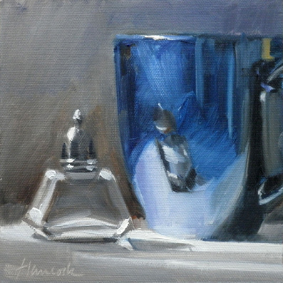
I spent a lot of time on the reflections in the cup.  I really enjoy the yellowish spot on the cup which reflects something out of view.  It keeps the painting from being monochromatic.

Friday, February 24, 2012

Kiwis and Glass Jar on Green


Kiwi fruit is covered by a fuzzy brown skin, but the skin is actually very thin and light can still shine through it. This light makes the kiwis glow from within.  I also like the lost edges of the jar. 

Wednesday, February 22, 2012

Apple Slices Backlit SOLD

This was a tasty greenish apple with touches of red, or maybe it was a reddish apple with touches of green. Although I painted quickly, the hot light turned it brown.  Next time I'll douse it with lemon juice to stay white.

Sunday, February 19, 2012

Two Horses SOLD

Two Horses in a pasture with sunlight. A simple composition with color dominance, interesting shapes, and uneven intervals.  In the reference photograph,  there was a fence in front of the horses.  The fence also blocked a viewer from entering the painting.  I took out the fence so you could see the horses, and I added diagonal brush strokes to lead the viewer into the field.

Friday, February 10, 2012

Pinto Pony SOLD
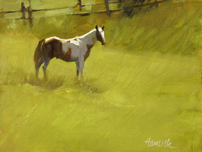
The sun is high and slightly behind this pony and creates a wonderful light edge on the horse's back that tells us it's a sunny day.  This horse was spotted (no pun intended) in a pasture near Prosser, WA.

Friday, February 3, 2012

Near Dockton SOLD

A sunny view of houses on the beach at Quartermaster Harbor near the Dockton Marina.  The pilings are left from boatyards and drydocks that were built over a hundred years ago.

Wednesday, February 1, 2012

Open Fence SOLD

This building is an old carriage house now used as a horse barn.  It has a small paddock attached for the horses.  I added an open gate to the fence so the viewer felt there was a way to "walk into" the painting.  One of my favorite times of day - late afternoon with warm lights and purple shadows.