Wednesday, April 27, 2011

Monashka Beach SOLD

A beach in Monashka Bay, Kodiak, Alaska.  The view looking from Ft. Abercrombie towards the Three Sisters mountains.  When it's sunny, there's no place more gorgeous than Kodiak.  

Sunday, April 24, 2011

BLack Cup Orange Slices on White and Gray

I put the still life set up on a piece of glass laid over a white tablecloth.  It's similar to a mirror, but it gives fainter reflections, and allows the white tabletop to come through.  I really like the gray shapes in the shadows areas, and I like the purple color of the yellowish pith in shadow

Wednesday, April 20, 2011

Grapefruit Slices, Pink plate SOLD


I had the pink plastic plate in the studio and I set some leftover orange slices on it while I was arranging another still life. I started working on the other still life, looked over and realized that the wild colors looked exciting, so I had to paint this one too.  What's the dominant color?  I think it's the vivid areas of warm reddish orangeish pinkish color in the center of the canvas.  But maybe its the orange of the slices. 

Monday, April 18, 2011

Orange Slices on Green Plate

I love the vibrant colors.  The total effect is harmonious because the colors of yellow-green, yellow, and orange are analogous (next to each other on the color wheel).  You would think that the lime green would dominate, but because the orange is dark and so intense, you still see the orange first.

Saturday, April 16, 2011

Four Orange Slices on White SOLD

Another painting of orange slices from a while back.  I hadn't posted it, so I thought it would fit in with my current orange-mania.  I like the white around the slices.  It's actually mostly blue-gray, but your mind tells you its white.  

Internet fame

I've just been featured on another artist's blog.  Jane Sloss saw my paintings on ETSY, liked them, and featured me on her blog.  She did an interview with me and posted my work on her blog.
Go to http://waterpaintings.blogspot.com/ to see my work there.

Four Orange Slices on Blue-Green SOLD

This is a painting from a while ago but I hadn't posted it and I'm on an orange slices obsession just now. I like the shadows cast by one wedge onto another wedge.  And I like the translucence of the color in the shadows. And I like the complementary contrast of the blue-green and red-orange colors.  And oh, oranges are good to eat, too!

Wednesday, April 13, 2011

Blue Cup, Orange Slices, Sail Shaped reflections SOLD

Another painting of orange slices and a shiny blue cup.  I placed the cup & orange slices on a piece of glass to get reflections.  I like the angular shadow shapes created by the combination of shadows & reflections.  And I always like the orange, burnt sienna, ultramarine blue color combinations - they make lovely grays.

Saturday, April 9, 2011

One Radish on White

The radishes aren't up in the garden yet, I was getting spring fever and bought this one at the grocery store.  My intention was to keep the background very high key,  and to work on those loose edges

Thursday, April 7, 2011

Green Apples Black Cup Silver Fork
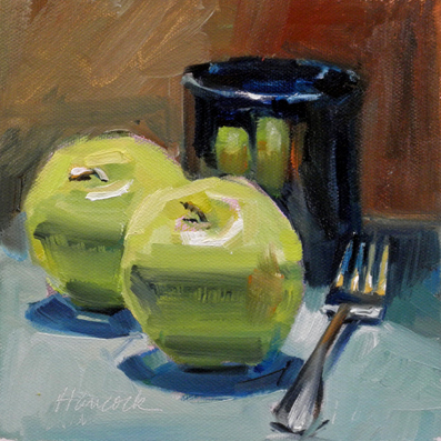
I know you can't eat apples with a fork, but the fork looked more interesting than the knife.  I like the yellow and blue on the tines.  I also really like the reflected light on the apples.  A strong downlight gives a great bounce back on the underside of the apples. 

Thursday, March 31, 2011

Single Camellia in a Glass Bottle

A friend brought a bouquet of camellias so of course I had to paint one.  They are waxy and stiff - the leaves are especially sculptural.   It was important to capture that little sliver of light showing on the edge of the leaf to give that impression of stiffness.  I especially enjoyed the light shining through the bottle onto the tabletop.

Wednesday, March 30, 2011

White Bowl with Orange Slices


This painting was painted for the Daily Paintworks Challenge -which was to paint a white object.  This white object happens to be a majolica bowl which was created by my daughter Annie.  The white bowl is decorated with yellow and green dots which echo the yellow and green background and tabletop. 
You can see Annie's pottery at her Etsy shop at http://anniespottery.etsy.com
The yellow and green and orange slices remind me of lemon lime and orange sherbet - just what I need to put in the bowl.

Friday, March 25, 2011

Four Brown Eggshells in a Row SOLD

I posted this painting last June, but I reworked the background so I wanted to show the brand new version.  The old version had a lot of burnt sienna in the background - mixed with white it makes a sort of flesh tone.  I had been staring at the painting for a long time and decided that it was just too pink and too harmonious and lacked punch, so I changed the background.  I like it better now

Tuesday, March 22, 2011

Madrona Hill

The south end of Maury Island is covered with large stands of Madrona.  They like the sunlight and drainage on the steep hills.  They have beautiful reddish bark and green leaves most of the year. 

Saturday, March 19, 2011

Beach View Sunny Day SOLD

Painted from some photos taken on the Oregon coast last year.  This was one of those super long sandy beaches with light colored sand and so much blue sky and blue water that it seemed unreal.

Wednesday, March 16, 2011

Apple Slices Pewter Bowl Purple Background

The pewter bowl is back again.  Here is the set up with a purple background.  I like how the light is positioned overhead so that the right side of the apple slice gets a slightly different amount of light than the left side.

Monday, March 14, 2011

Taylor Lake

As I was painting this scene of Taylor Lake, I kept taking out more an more information.  I tend to focus on the distance and have to keep reminding myself to make it cooler, paler, and less contrasty.  It's easy to be tight and fussy and busy; you have to concentrate to make it simple and loose - just the opposite of the way you'd think it would be.

Saturday, March 12, 2011

Apple Slices Pewter Bowl on Gold

I finished this painting and put it aside for two days and then realized I needed to tweak the reflection in the pewter bowl.  It was too bright; the reflected apples had to be duller than the apple slices on the table.  Sometimes when you're painting you can get the individual parts and pieces to look right, but still the painting doesn't hang together.   So you have to look at the painting as a whole to figure it out.  The final version is on the top, the original version on the bottom.

Wednesday, March 9, 2011

Two Radishes, Dark Shadow

Radishes do NOT shine, so no bright highlights here -those red roots needs to be kept low contrast.  Also, radish leaves wilt in the bright light.  So the painting starts in one spot and definitely winds up in another.  Best painted very quickly.

Sunday, March 6, 2011

Rocks and Wet Sand SOLD

This painting was inspired by a short visit to a (name-forgotten) Oregon beach last fall.  The sun was out, the tide was out, the sandy beach was flanked by two rocky headlands and white surf foamed around the rocks.  A memento of a perfect moment in a day of driving and sightseeing.

Thursday, March 3, 2011

Green Apple Slices Pewter Bowl Tablecloth

Another pewter bowl painting.  The light is from the right.  It hits the pewter bowl, bounces back and hits the back side of the closest apple.  It was fun to capture that reflected light.  I also worked on softening edges - for example the lip on the far side of the cup. The strong color dominance creates unity and harmony, but is enlivened by the touch of red in the reflection.

Tuesday, March 1, 2011

Near Prosser SOLD

This painting was inspired by a trip that we took in the fall - through the White Pass to Yakima, Pasco, and finally to Palouse Falls.  The country is such a different color from the Puget Sound Region--the vegetation is different, the ground is different, the color of the sky is different, the quality of the light is different.  Fun to try to capture.

Monday, February 28, 2011

Three Eggplants Pewter Bowl SOLD

These small eggplants came from my favorite grocery store, Uwajimaya's.  (You can buy almost any type of produce there). These eggplants are only 3 inches long but have a beautiful color.   They are so dark that they go well with the shiny mirror-like quality of the pewter bowl.

Sunday, February 27, 2011

Green Apples Glass Jar on Purple

This is my entry for the current Daily Paintworks Challenge,  The challenge was to paint one color per stroke.  Mix a color, put down a stroke, mix another color, put down the next stroke.  I was looking for larger and larger brushes so I could put down a larger area with one stroke.  And in a few places I fudged and actually put down more than one stroke with the same load of color.  The effect is juicier and thicker than I usually paint.  It was fun.

Thursday, February 24, 2011

Creek View SOLD

This painting was inspired by a trip to the Oregon Coast.  There were lots of hills along the coast and hundreds of creeks fed from those hills and crossed the highway towards the ocean. Because I enjoy focusing on the distance, I have to work out how to represent the near view and the far view all in the same painting.  Even though, in reality, the near greens and the far greens were not that different, I pushed the far view back by making those colors lighter, bluer and less contrasty.

Sunday, February 20, 2011

Red Onion on Green SOLD

My One Year Blogging Anniversary.  

February 21 marks the one year anniversary of this blog.  I have posted 127 paintings (this makes 128), most of them created during this year.  I think that the work of frequent painting has made me improve.  I can see mistakes more quickly and have a clearer vision of what will make a good painting.  I'm still working on simplification, lost edges, and broad interesting brush strokes (as opposed to multiple tight fussy brush strokes).

This is an example of an extremely simple composition, but with a nice dynamic balance.  The onion is slightly off center, and the flag of the stem gives it a nice diagonal push.  I've lost an edge in the shadow of onion and I've softened the edge in the foreground where the still life material drops over the edge of the table.   I enjoy the simplicity of the complementary red/green color scheme.  There is a bit of reflected light in the cast shadow, on the underside of the onion and in the stem.  And I like how the onion has light-struck warm areas and shadowed cool areas; the onion is not just red--it moves from red orange to red purple, echoing the gradation of the shadowed background which goes from cool dark green to warmer lighter green.


Thanks to all the people who look at my blog.. I appreciate your comments and opinions.  

Friday, February 18, 2011

Grapefruit Glass Bowl on Green SOLD

The grapefruit were the excuse to try painting the glass bowl.  But they do make a nice color contrast to the green.  I like how the light bent around the bowl to make the grapefruit fade out on the lower right.  And that cast shadow crossing the grapefruit that was created by the rim of the bowl.

Saturday, February 12, 2011

Three Persimmons on White

This is the last of the persimmon paintings - they finally gave up the ghost.  This is  my favorite; I especially like the simple strokes of the leaf of the shadowed persimmon.  And I like the contrast between the warm light-struck foreground and the cool shadows.  I am always amazed at how long it takes to make something "simple," and how deliberate your strokes have to be to be "loose"

Tuesday, February 8, 2011

Three Persimmons on Orange


The limited palette emphasizes the color of the persimmons   I liked the chunky leaves -very sculptural.  They were dark and very neutral in color and even the light areas were not very light.  It was fun trying to paint them without being too tight.

Thursday, February 3, 2011

Bandon Lighthouse-Bold Brush Painting Entry SOLD

This is my February entry in the online bold brush painting competition.  Please go to http://canvoo.com/boldbrush/painting/16858 TO VOTE FOR MY PAINTING.
And thank you to those of you who look at my entries.

Tuesday, February 1, 2011

Three Persimmons on Gray

These persimmons have been sitting on the counter for weeks, waiting to ripen.  All of a sudden they were past ripe and turning to mush, so it was time to paint or throw them out.  I really like the thick sculptural leaf and chunky stem at the top of each fruit.   I think the persimmon in shadow makes a nice contrast to the light struck fruit.